project DETAILS
CLIENT:trivago
DATE:20 AUG, 2020
Location:Dusseldorf, Germany
This main purpose of this project was to discover and explore a long term vision for the filter menu on web. The outcome was to test this with users and get some quantative data.
trivago had been struggeling to find out a proper way to display all the new filters in the results list. I was going to find a better way to display information in the information architecture.
1. OBJECTIVE
Discover user problems in the current implemention of the filter menu. Find a way too make the filter menu more intuitive.
2. MY ROLE
My role was to discover, organize workshops, discuss with stakeholders, design the solution and set up a test plan to validate.
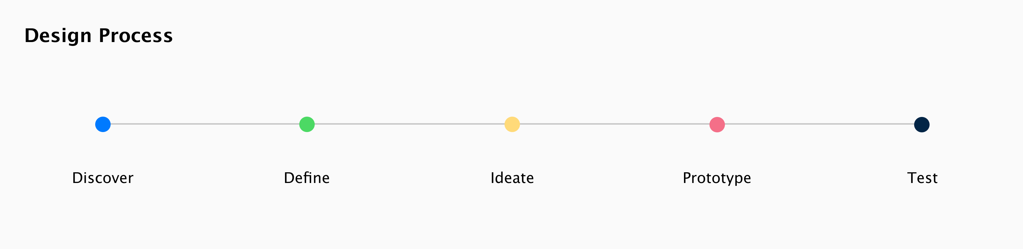
3. APPROACH
I went into this project with a design thinking approach. Identify problems and making quick solutions that we could test out.
EMPATHISE
Moderated Tree testing
What: Research method used to asses and improve the findability of items. How: Asked a sample of participants to find a specific item, list out a high level organization and let them click through till they find it or give up. Sample size was between 5-10 participants for accurate results. Why: Since the IA differs on platforms it is good to know if users are having trouble finding items and which ones work as intended.
Benchmarking
What: Research method used to gather examples from competitors. How: As a part of the competitor analysis go through roughly 4 competitors and make a collection on the patterns they use for the feature at hand. Store these images somewhere like I have done in Invision. Why: Most of the time it is not necessary to re-invent the wheel and competitors have already done their research.
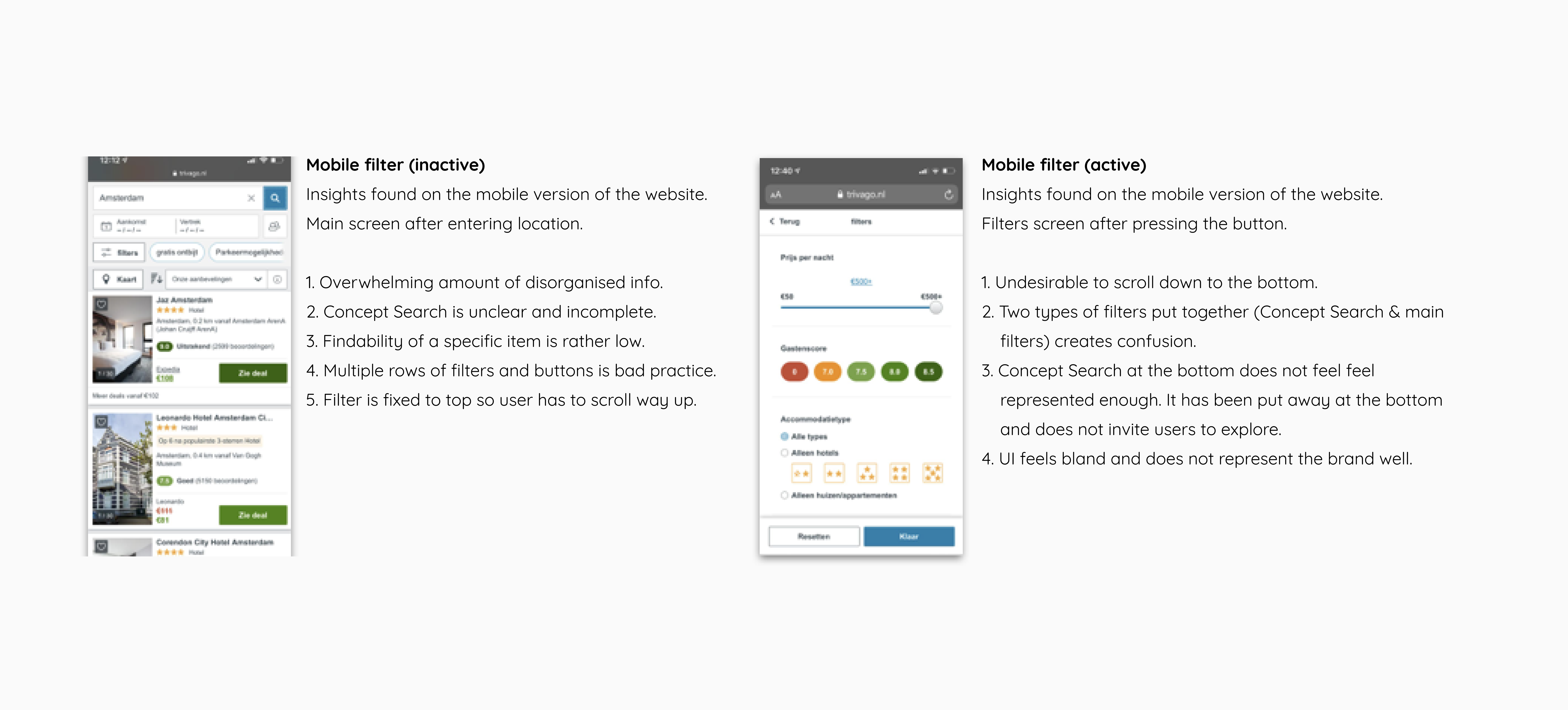
TREE TEST LEARNINGS

DEFINE
Problem Statement
After collecting the data I need to synthesize what I have learned while looking for insights and needs. The three problem statements are listed below. The problem defining step is ambiguous, that is why there are methods to get to the core of the problem here to the right. 1. 5 why’s 2. important to users. 3. Personas 4. (Re)definition
Problem A
How might we create an evolution of trivago’s filter experience on mobile so the experience feels more intuitive like desktop?
Problem B
How might we design the interface for mobile in a way that invites the user to explore the Concept Search because this leads to more bookings?.
Problem C
How might we design an interface that has more structure and is not cluttered with filters and information that might confuse the user?
IDEATE
Sketches
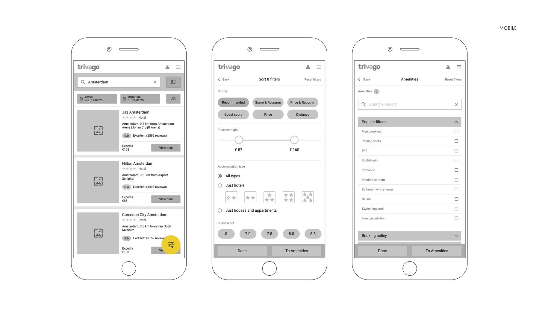
After having defined the problem it’s time to start drawing possible solutions. My intention is to focus completely on mobile for this case. Desktop could be handled in a different phase seen time constraints. We start of with a couple of lo-fi wireframes. The link to Invision here.
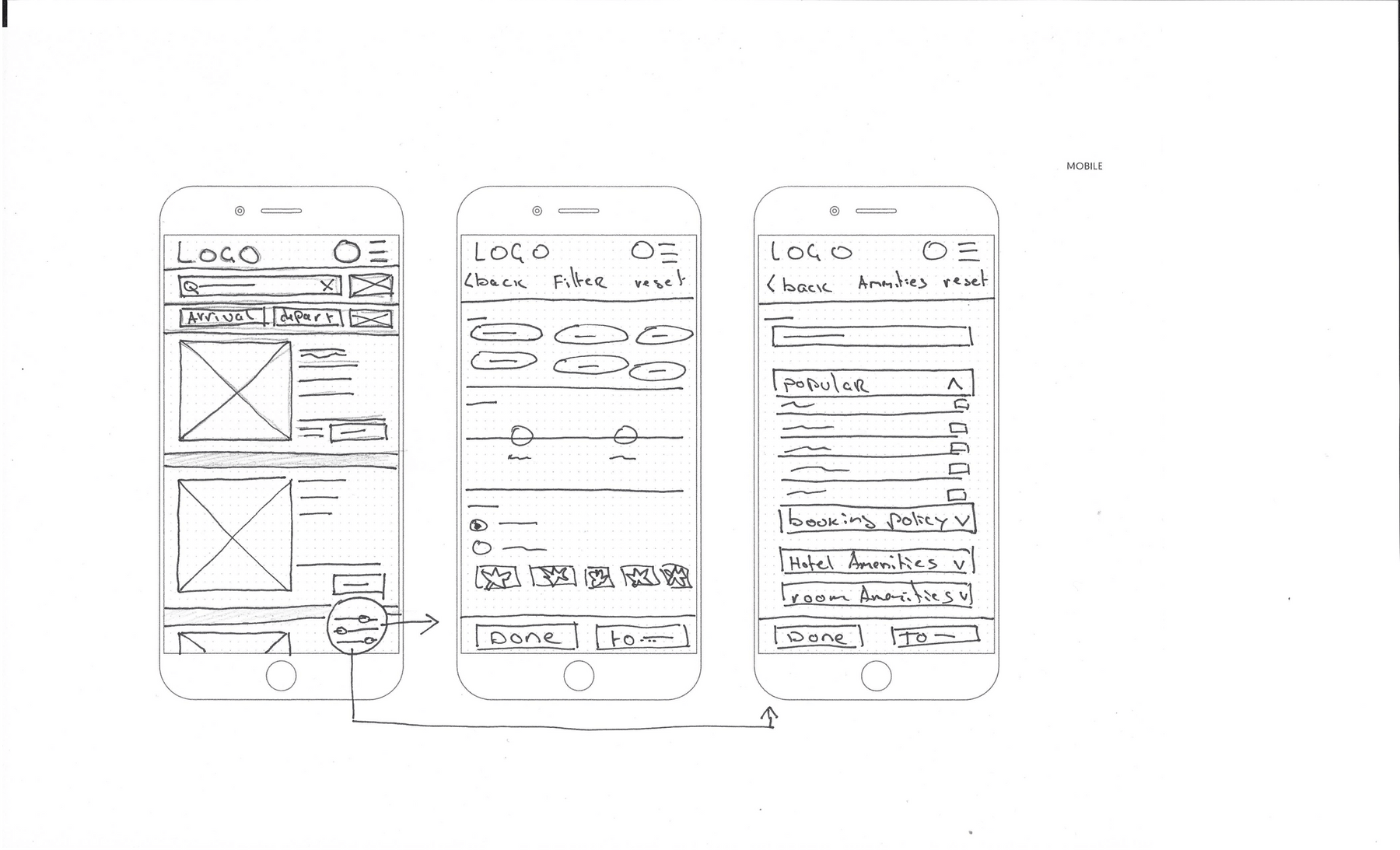
Solutions to handle the problem statements.
What: 1. Removed the “Sort’ and ‘Concept Search’ from the interface. 2. Placed map next to the location input. 3. Relocated the ‘filter’ button to the right bottom of the screen (floating button). 4. Put the 4 biggest filters on 1 external screen and the Content Search on another.
User flow
Why: I wanted to do all the sorting and filtering on an external page. This makes it easier for the user and prevents visual clutter. I want to separate filters and concept search since they are different functionalities. The filter button is a floating button and does a few positive things: stays in place while scrolling, draws attention because of its color and placement away from the menu.
Mockups
After the first sketches I took it to Figma and started working the wireframes out. The result is found below. I am still considering the next/previous menu on the bottom of the second and third screen. For full resolution this link. here
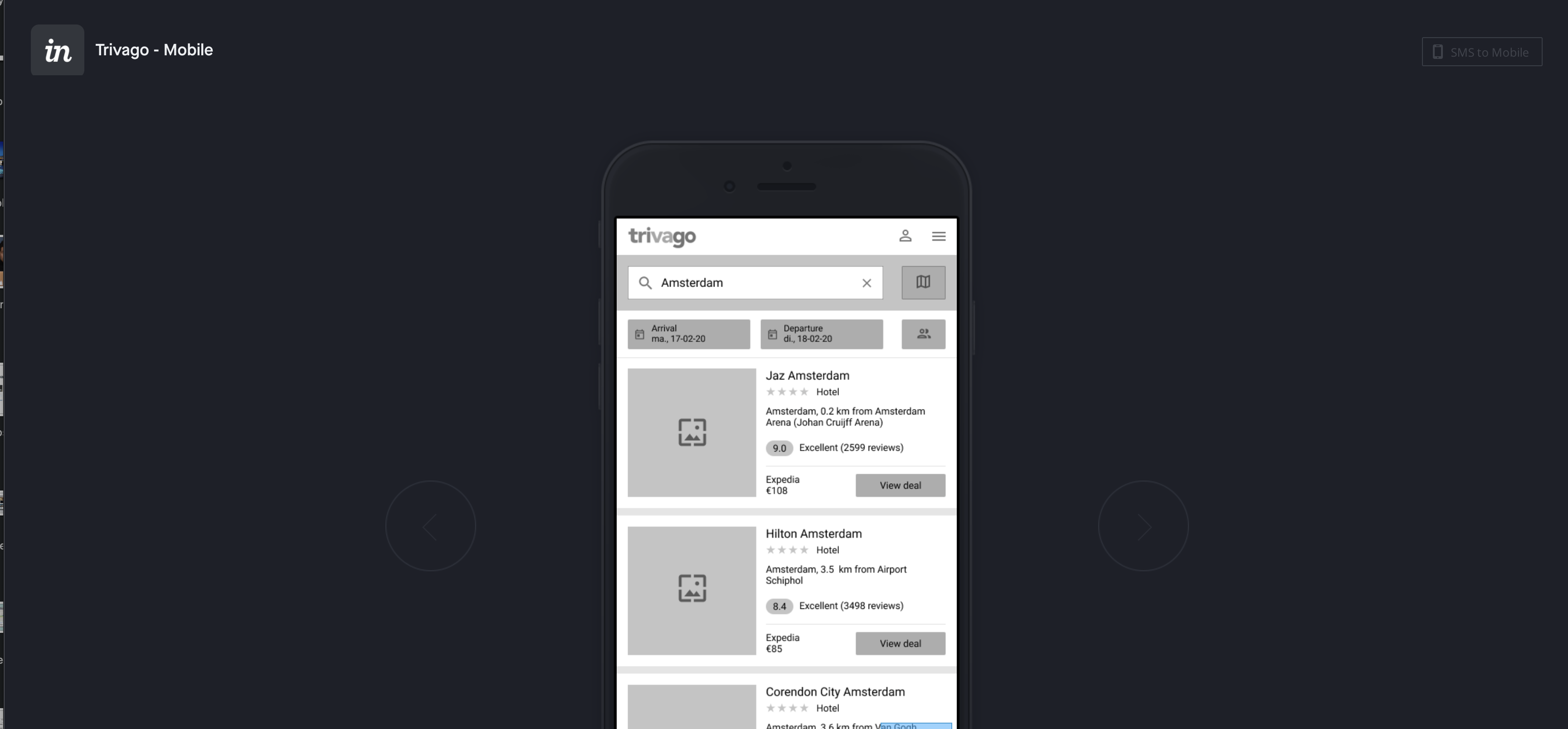
Mobile prototype Invision
What: A better visual representation of the hand drawn solution on the previous page. I am using real content taken from the the website.
User flow
Why: The hand drawn wireframes are excellent for testing with stakeholders and communicate what your are trying to do other designers. These screens and for the next step. Now we can pinpoint possible pain-points and flaws in the design. This allows us to iterate and make the mockups ready for an actual prototype so we can start usability testing.
PROTOTYPE
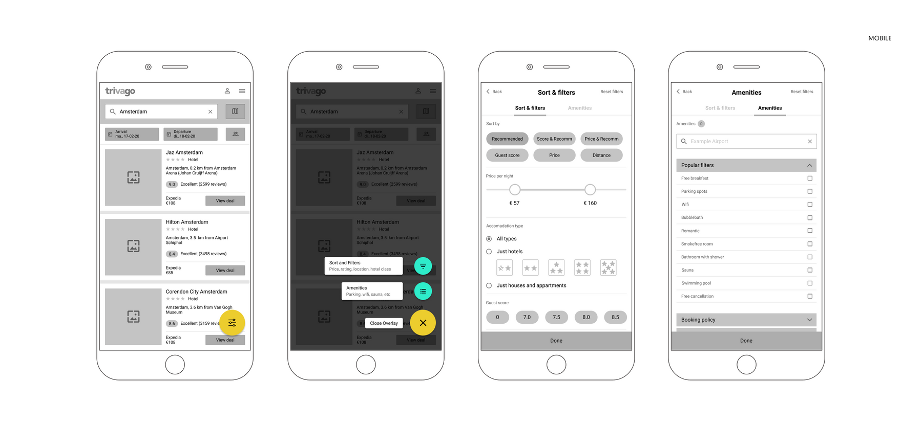
After the change to the mockups I made a few alterations to the interface. I added a screen for reasons posted below image. The reason for this step is to make a prototype to do usability tests. Not going into too much details since that could be a waste of time. A link to full resolution image can be found here. *Important: link to the prototype can be found here
Mobile prototype Invision
What: What: I added a screen (overlay menu) called by floating filter button. I added a nav topbar so user can toggle between ‘Sort & filter’ and 'Concept Search'
User flow
Why: The Concept Search needed more attention due to business requirements. I wanted to make it easier to explore the function so I added them as a button in the overlay. In the overlay text placed in front of the button with a description to see what’s inside. This will make it intuitive and invites exploration. The top nav is implemented because the user should be able to swap quickly without thinking too much.
Final designs
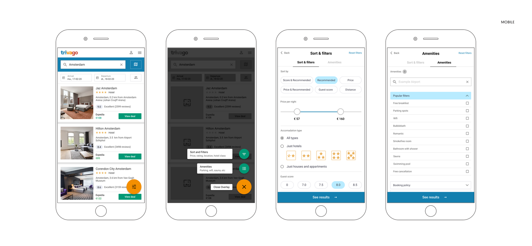
1. What
This is a representaion of the actual application. I replaced the placeholder for the text with an actual font and the screens are they look more real.
2. How
I made a design system for the various components of the application this determined the font size, icon sets and I chose a map that is more representative.
3. Why
The case stated needed to be tested asap. When testing with users its best to do so with an accurate representation. I set up the prototype.
Design solution
Problem statements
A). How might we create an evolution of trivago’s filter experience on mobile so the experience feels more intuitive like desktop? B). How might we design the interface for mobile in a way that invites the user to explore the Concept Search because this leads to more bookings? C). How might we design an interface that has more structure and is not cluttered with filters and information that might confuse the user?
Problem solutions
A). On mobile the problem was the Concept Search was very awkwardly presented on the screen and hidden on the bottom of the filter screen. On desktop Concept Search got its own dropdown so I recreated this in my design by giving it its own external screen with the focus on the amenities. B). The way I solved this was to let the user make a choice between the 4 big filters and the Concept Search in the overlay. I gave context with the button so the user will know what to find there. Also I made a top-nav menu that user can intuitively swap between ‘Sort & filters’ and ‘Concept Search’ C). Because having multiple rows of buttons and dropdown is a bad practice I removed some of the sorting and filter options and moved them to an external screen. Since the user would be redirected to one anyway it make sense to let the user do ALL the filtering and sorting in one screen. Final point is the floating button that prevents the user to have to scroll up to the fixed menu on top.